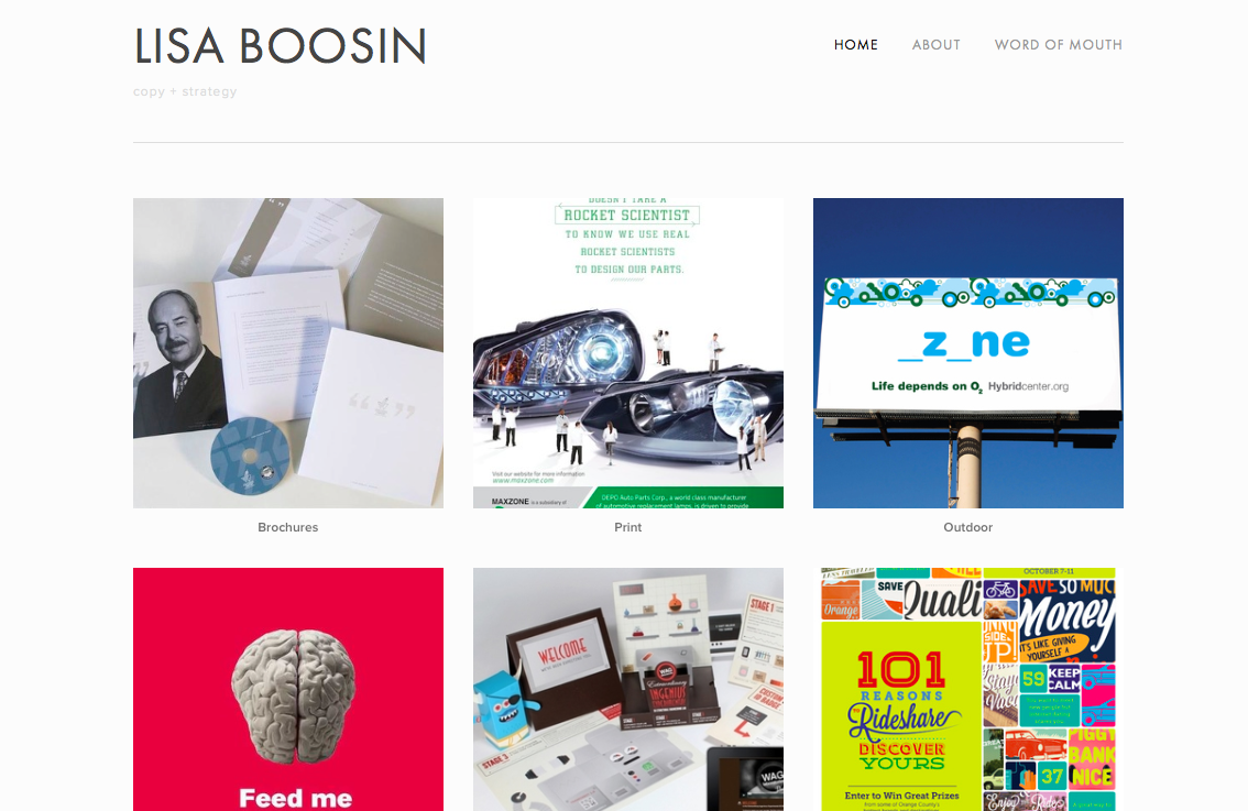
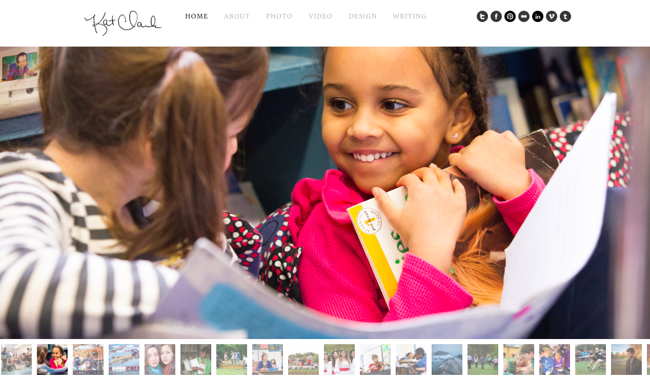
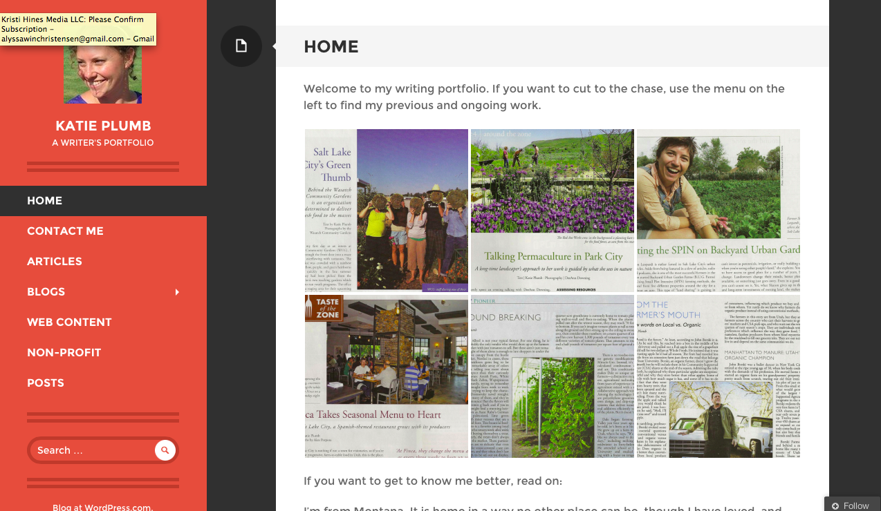
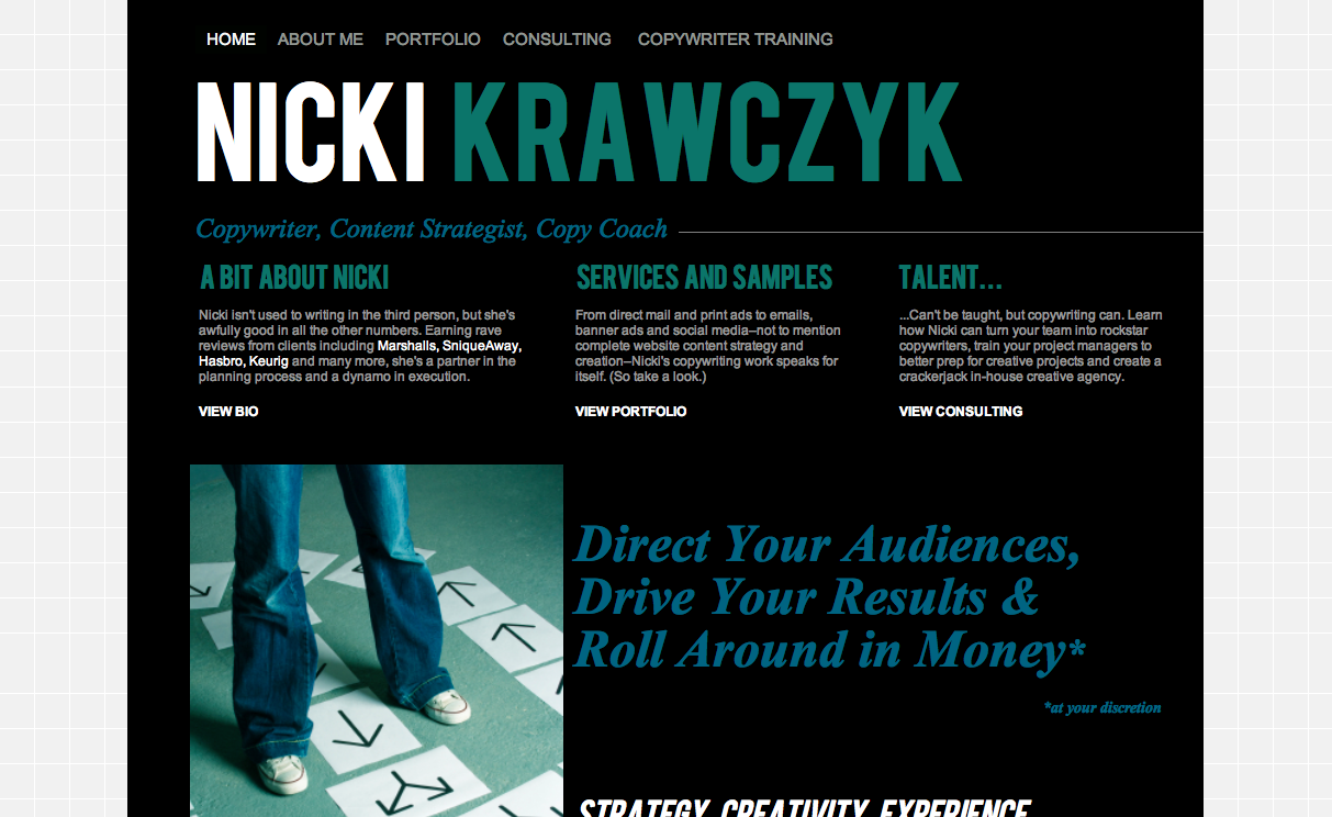
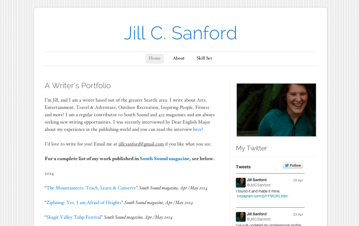
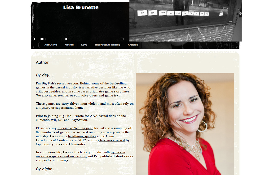
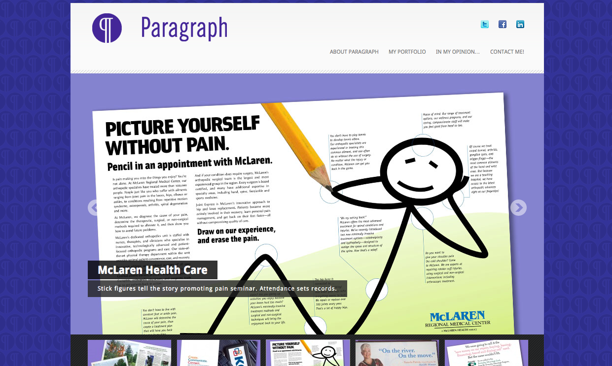
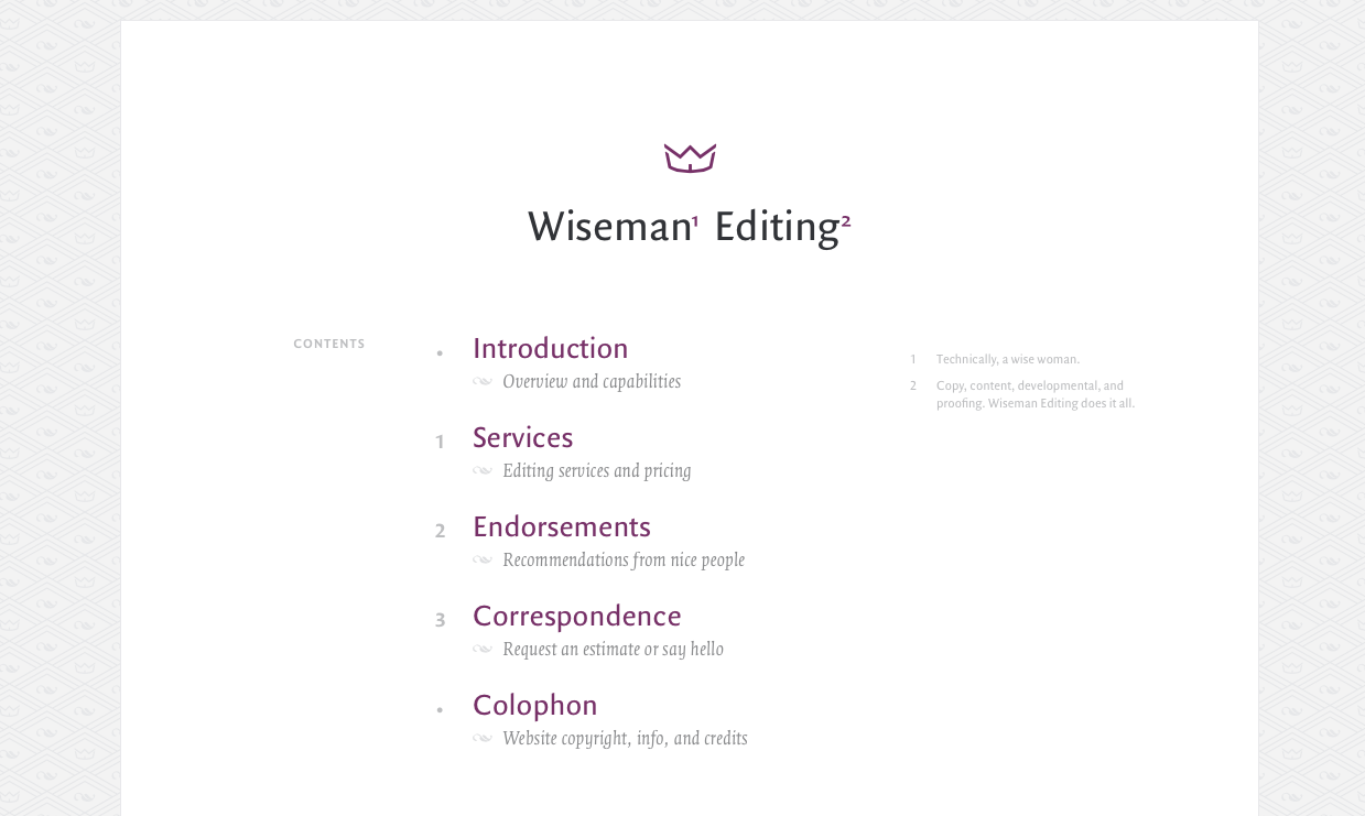
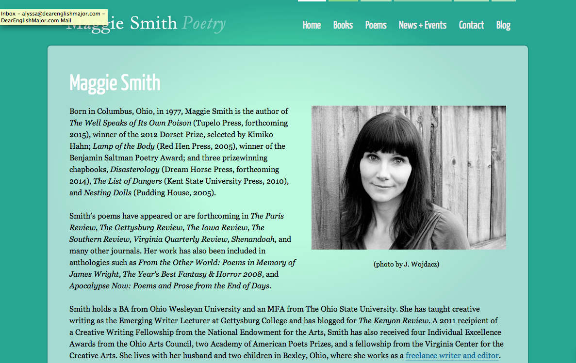
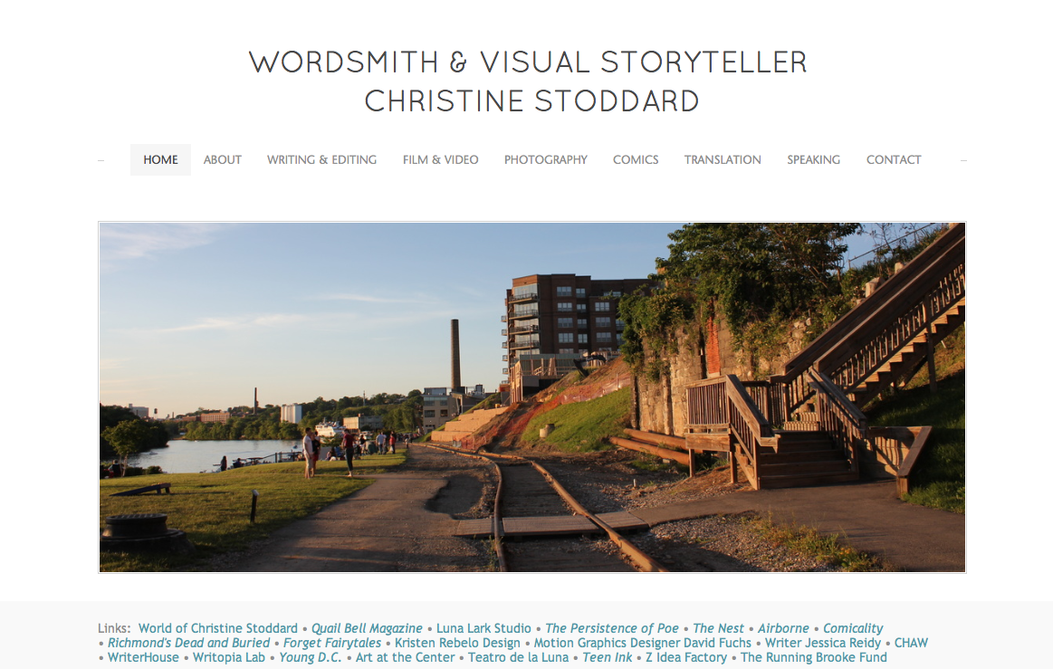
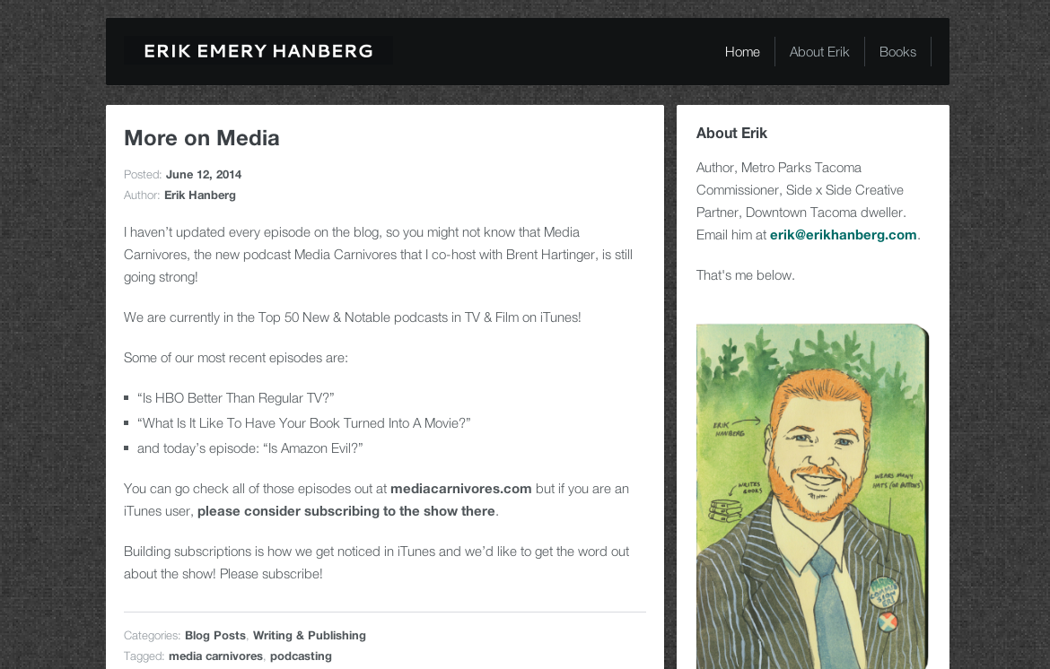
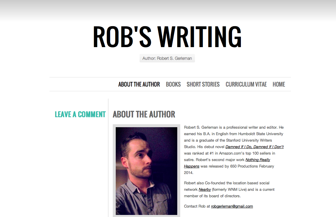
If you’re pursuing a career as a professional writer, having an online portfolio is an absolute must. When we say “online portfolio,” what we mean is a website that showcases your work, the same way you would in a binder of newspaper clippings (does anyone do that anymore?!).
Having an online portfolio allows you to direct potential employers to a single, permanent space where your work will always be accessible. It won’t get ruined in the rain and it will never go out of date (if you update it regularly, that is!). Even more importantly, it improves your professional online presence and creates a platform on which to market yourself, which is really what finding a job is all about. Plus, it shows how tech-savvy you are—a huge selling point alone!
There are so many online tools available, many of which are even free. But regardless of which one you choose, consult our expert checklist below to ensure your online portfolio is polished, professional and effective!
Relevant domain:
- Having your own domain name doesn’t cost much and it shows that you are serious about being a professional! Use your own name, a business name, or a short phrase that reflects your goals. Remember, it’s all about marketing yourself and creating something memorable.
Aesthetically pleasing design:
- Treat the design of your website as part of the portfolio itself. You want to show potential employers and clients that you have some web skills, but don’t worry—this doesn’t mean you have to become a web developer or a coding expert. Many designs are already built for you, and you have the option to customize them if you want. Also keep in mind that what is ‘hip’ in design is constantly changing. You don’t want a site that looks like it was built in 2005—things have come a long way since then.
Professional headshot:
- Making a good first impression with a professional headshot is crucial. Think of it this way: you’re the product you’re trying to market! This doesn’t mean you have to be a model, but getting your photo taken by a professional photographer—or even a friend with a great camera—is an investment you won’t regret! You can use this headshot in countless places, and it might be the first impression someone has of you and your brand. Lots of writers skimp on this, but it is absolutely crucial to your online image and the way you will be perceived. If you don’t care about representing yourself well, then how well will you be able to represent someone else?
Your resume:
- Whether listed directly on the site or provided as a PDF, including your resume offers an excellent way for potential employers to get a quick picture of your experience. Even a link to your LinkedIn profile is a good option.
Portfolio:
- This one is obvious at this point, but if you are going to bother making a website, then it needs to showcase your work! (You’d be surprised at how many professional websites lack this…) Include photos of completed projects, samples, screenshots, links, videos—whatever you have! It’s best to include a caption with each piece that at least details when it was created and what your contribution was.
Contact info:
- You don’t have to give away your soul here—a simple e-mail address that you regularly check will suffice! We definitely recommend against sharing your address online unless it’s an actual office and you want people to find you.
Optional:
Description of services:
- If you’re looking for freelance gigs, then you’ll want to include a list of your services and a brief description of each. Some freelance professionals choose to list their rates and fees directly on the site, while others prefer to keep that information confidential until they speak with a potential client directly. Either way, it should be clear from visiting your site what you do!
Testimonials:
- If you work with freelance clients, then this is a wonderful way to show off your street cred! Of course, some people take these with a grain of salt (who would post a bad review of themselves on their own website?) but it does show that you’ve worked with real people.
Dead pages:
Oops! How did that happen? Test every link on your page—it doesn’t look very professional if you send someone to your portfolio and an important page is broken.
Unfinished design:
- Don’t send anyone to your site unless it’s completely finished! Once you start a page, finish it.
Out of date information:
- Did you get a new e-mail address? A new job? Have your work responsibilities changed? Is 2008 the last time you made an update? It’s a good idea to give your portfolio a glance every few months. Consider adding a website updating schedule to your calendar.
Faulty links:
- Unfortunately, links to other websites do become inactive, and when they do, there isn’t anything you can do about it. But don’t let that deter you from including them on your site. Just be sure to test the published links periodically.
Spelling or grammatical errors:
- You may be a writer or an editor, but you’re still not perfect. Call in a favor from a co-worker or ask a friend to proofread the text on your site—the last thing you want is for a potential client or employer to catch an error when you’re the one claiming to be the grammatical expert!
No matter where you’re at in your career, an online portfolio is not only a huge professional asset, but it’s also a super convenient way to get your name out there! Creating one may feel like busywork, but trust us, the investment will pay off.
Need some inspiration? Check out the links below for some of our favorite online portfolios (all from Dear English Major contributors!):


